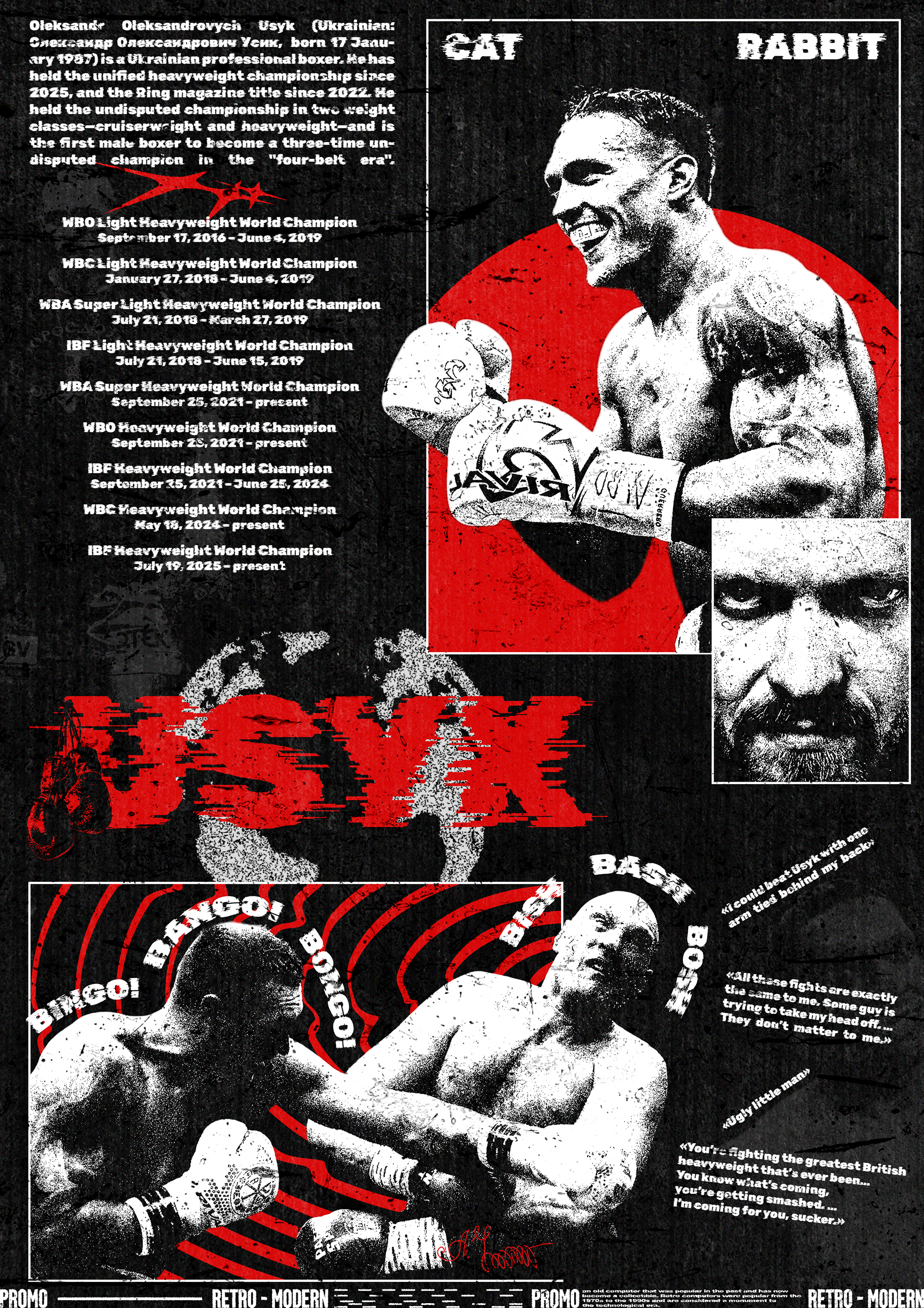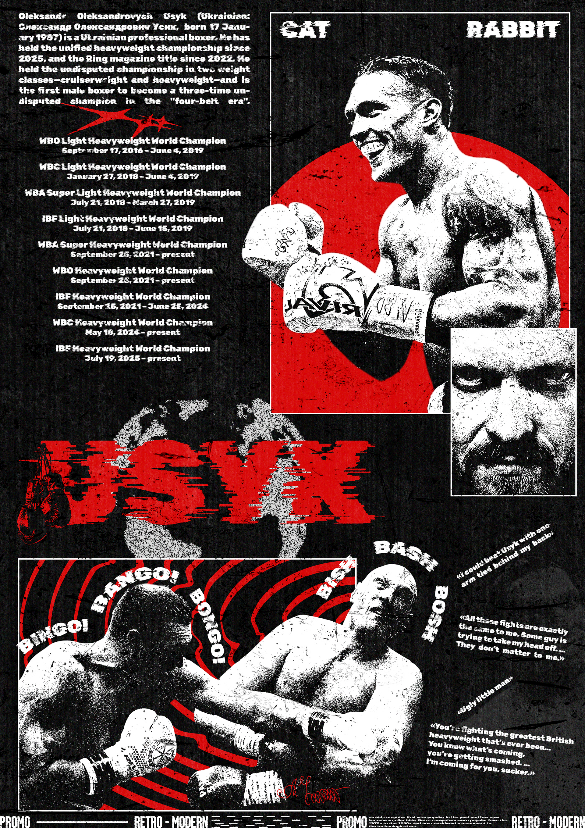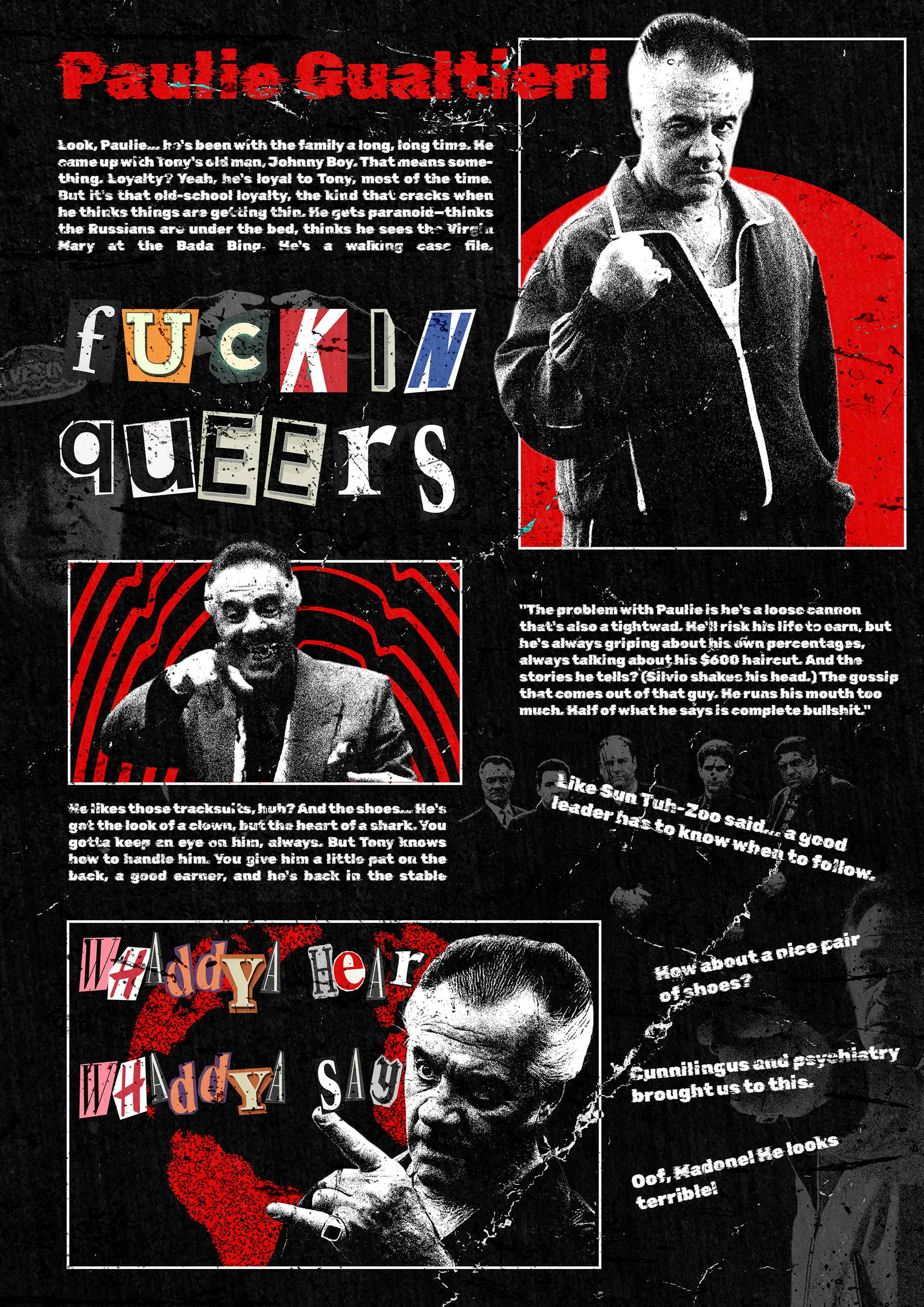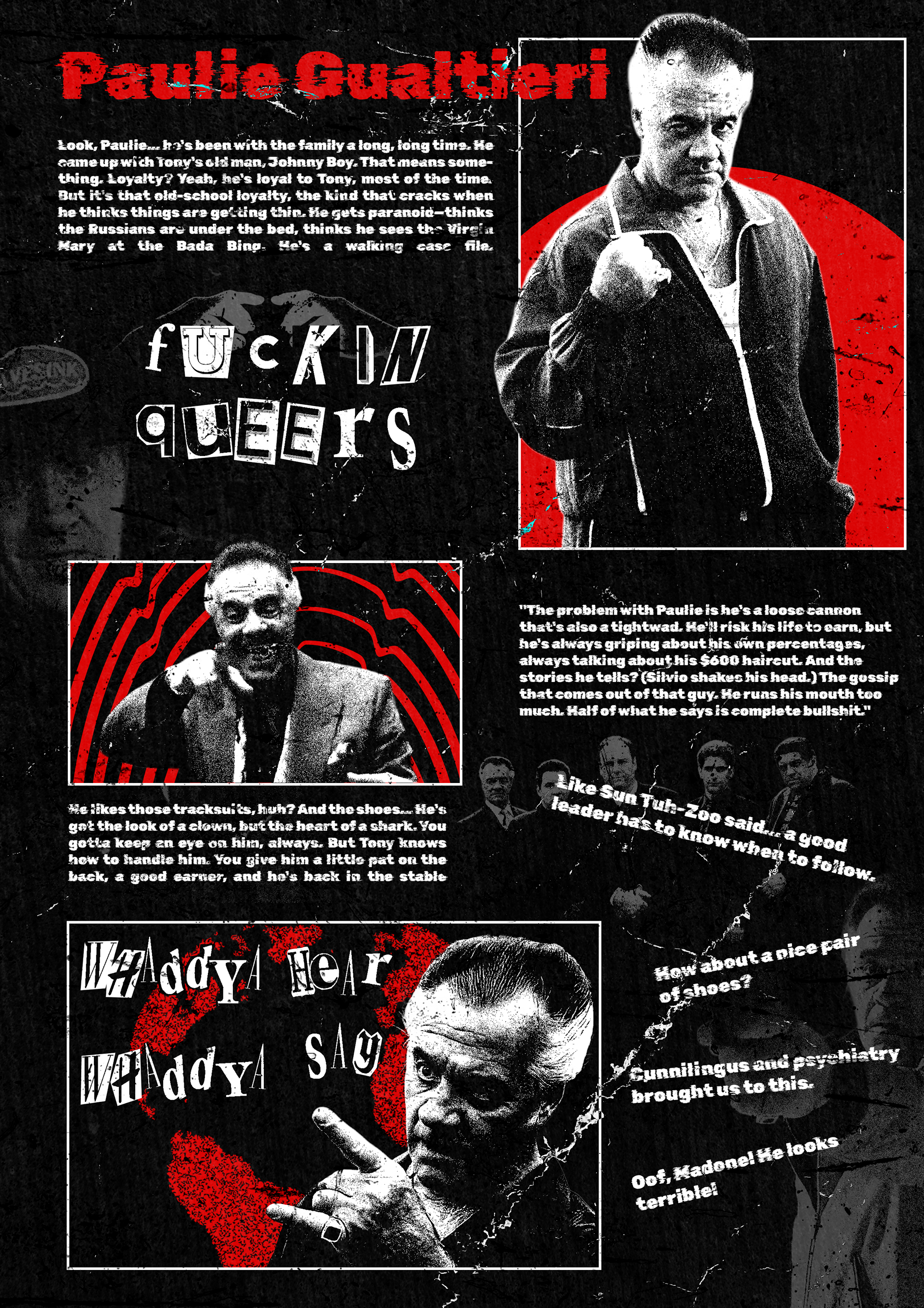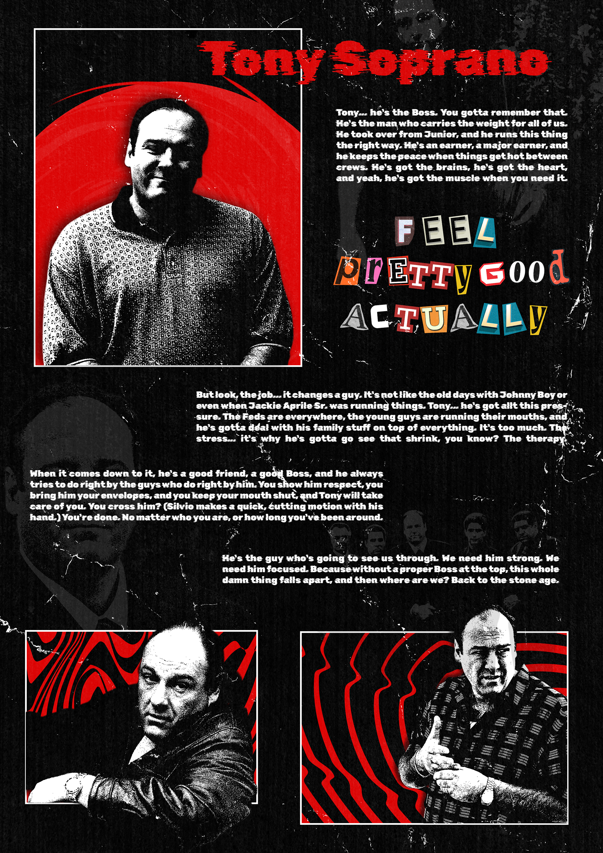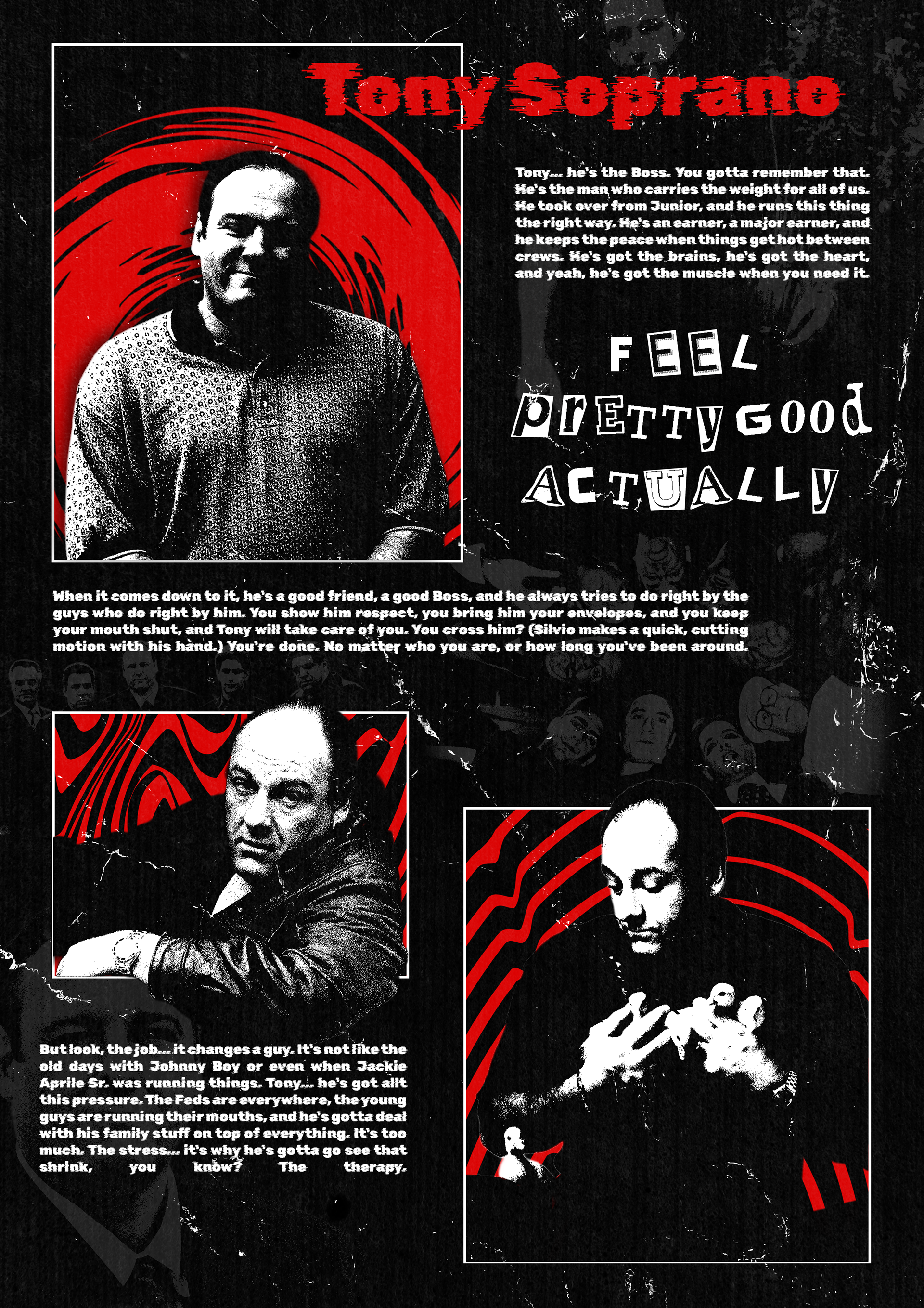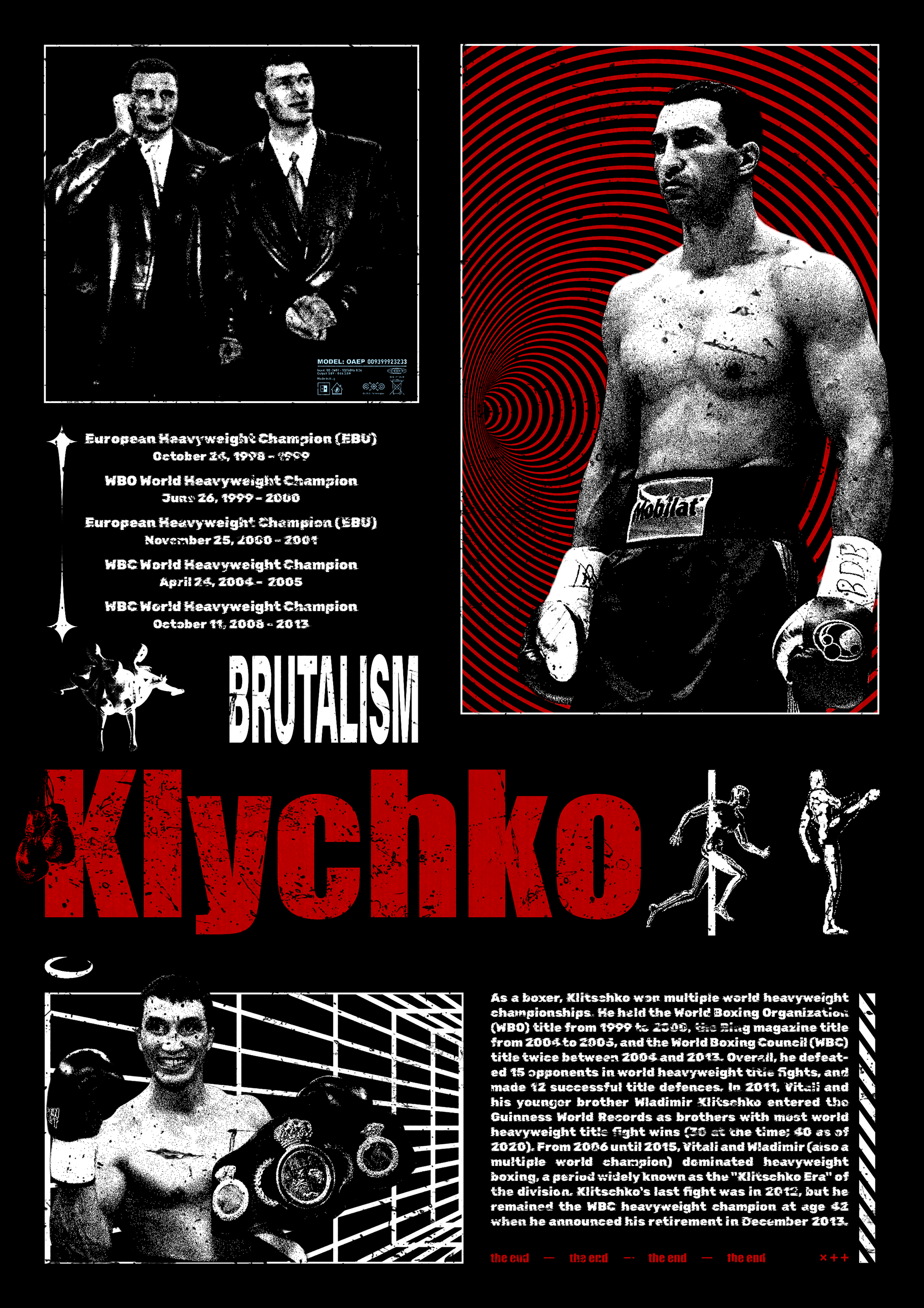
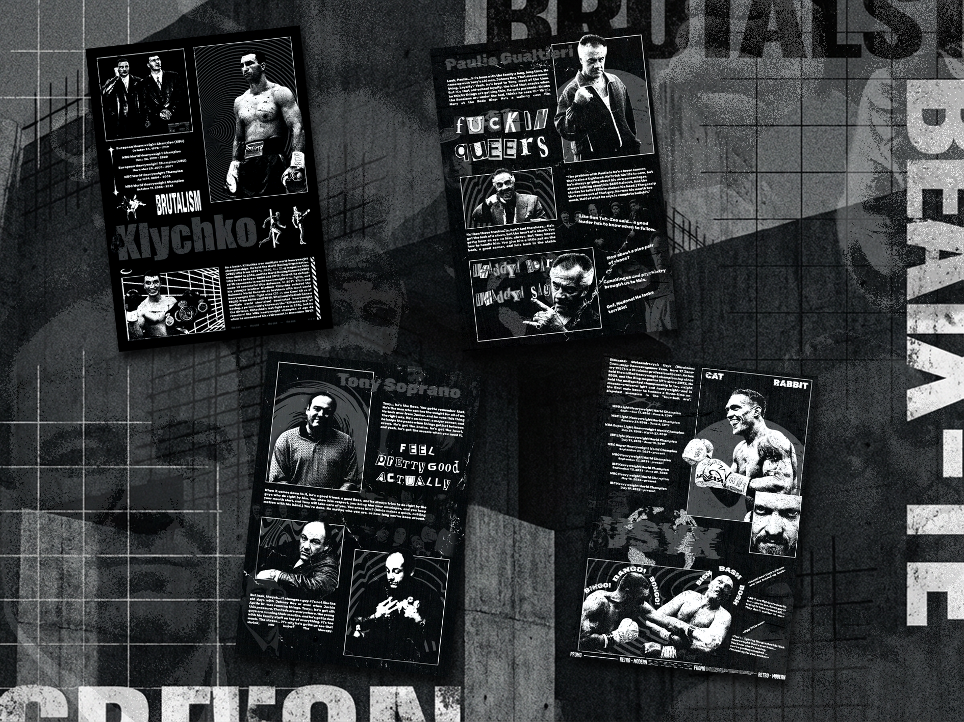
This project is a collection of my recent poster works focused on a brutalist visual language.
Raw typography, strong contrasts, rigid grids, and deliberate tension are the core of this series.
No decoration for the sake of decoration. Every element has a purpose.
Raw typography, strong contrasts, rigid grids, and deliberate tension are the core of this series.
No decoration for the sake of decoration. Every element has a purpose.
These posters explore balance between control and chaos, structure and emotion.
Rough compositions, oversized type, minimal color palettes, and visual pressure are used to create presence rather than comfort.
Rough compositions, oversized type, minimal color palettes, and visual pressure are used to create presence rather than comfort.
This series is an ongoing exploration of brutalism as a tool for communication — honest, direct, and unapologetic.